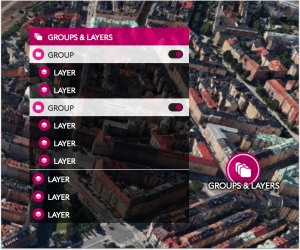
Explaining the new menu interface

Display revision for Viewpoints, Project Content, and Dialogue Categories

OpenCities Planner now shows Viewpoints, Project Content, and Dialogue Categories as menus.
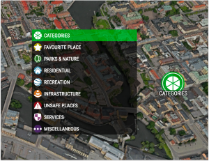
Menu example
Menu example

The menu system allows for more information to be presented with enhanced usability. The menu windows are scrollable, so now you can use an unlimited number of options. Furthermore, the menu allows for longer titles – without the need for awkward line breaks.
PROTIP

‘Just because you could does not mean that you should’: Try not to overwhelm the user with too many options.

Same structure, new options 

The underlying structure remains the same:

  • Viewpoints have one container
  • Layers can be on the top level or inside of a Group
  • Groups do not nest

We have added some new options, however. They are a bit advanced, so if you want to know more please read about them in the Help Pages.

If a Group or the Master Group is collapsed but it contains one or more Layers which are still on, it is indicated by a dot which appears with both stand-alone or menu icons.

Active content indicator

Auto-collapsing

On lower resolution screens, two changes happen automatically:

  1. Buttons collapse into a ‘Master Button’
  2. Menus collapse into a ‘Master Menu’
Collapsing into a Master Group

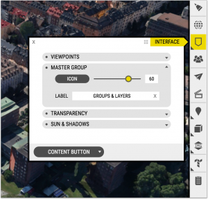
We call this the ‘Master Group’. You can edit the Icon and Label if you open the Interface Window and then the Content Button tab.

Interface -> Content Button -> Master Group

PROTIP

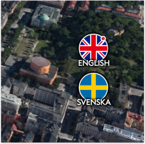
Try to choose clear and simple icons with a transparent background for the menu. It should be a symbol, not an entire scene.

Menu